Choose a relationship, not a matching brown
A teak sideboard often arrives before the wall-colour decision. You liked the proportions, the drawers worked, and now its warm surface looks unexpectedly orange against the existing paint. The answer need not be another furniture purchase. First work out whether you want that warmth to blend into the room or stand out.
Look at the actual piece from the doorway and from your usual seat. Is its colour mainly honey, reddish brown, dark brown or greyed with age? Is the finish glossy enough to reflect the window? Use those observations to shortlist paint. A species name does not specify the colour of a stained, refinished or sun-faded surface.
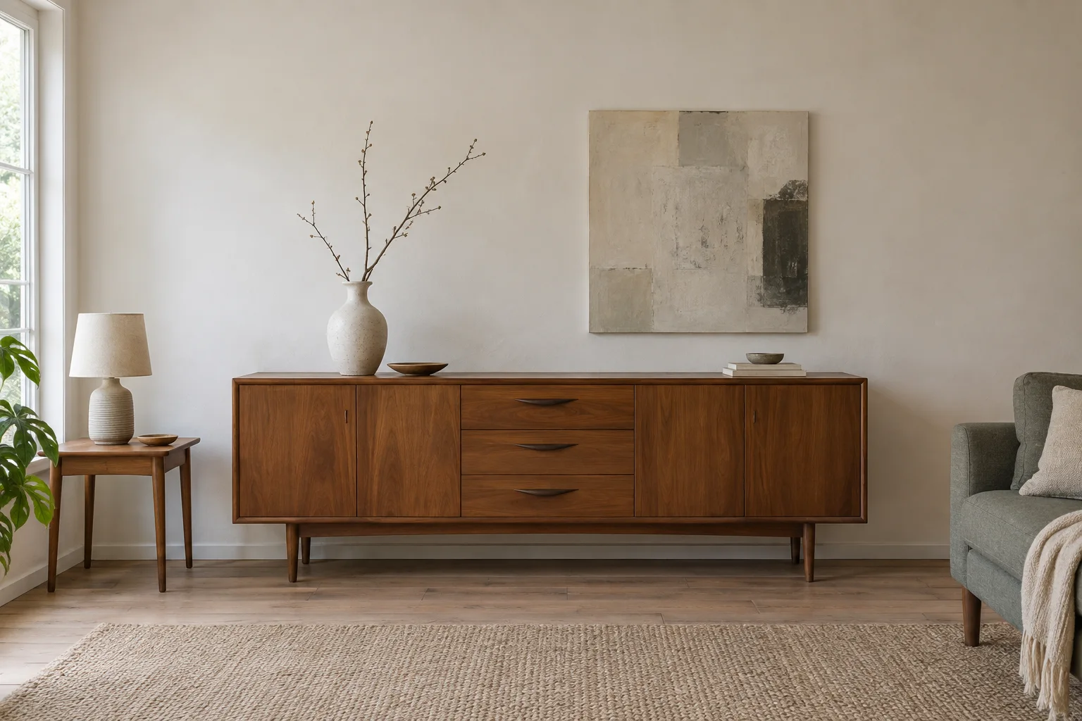
The three room studies here explore broad background choices around the same furniture arrangement. They are visual studies, not exact paint samples or evidence of wood species. Their purpose is to help you choose a direction worth testing on the wall.
| Background | What to look for beside your furniture |
|---|---|
| Pale warm neutral | Does the wood remain distinct without the wall looking yellow or pink beside it? |
| Muted green | Do you enjoy the warm wood standing forward, or does it make a red cast too conspicuous? |
| Deep blue | Does the darker field give the outline depth while leaving enough separation at the sides and legs? |
A pale background: let the wood carry the colour
A pale wall can leave the sideboard as the room’s main warm surface. Try this direction when you enjoy the wood colour and want a quiet setting for it. Compare the sample with the floor as well: a warm wall beside a warm floor can become more yellow than either looked alone.
For darker walnut, check the contrast around the whole cabinet. You may like the crisp outline against a pale wall, but find a brilliant white too sharp beside an old finish or cream upholstery. Try a softened neutral as a separate sample rather than assuming all pale paint behaves alike.
Stand far enough back to include the skirting and neighbouring wall. A colour chosen from a small patch directly above the cabinet may not work across the larger surface or at the doorway. Your furniture does not occupy the room in isolation.
Muted green: give warm wood something to answer
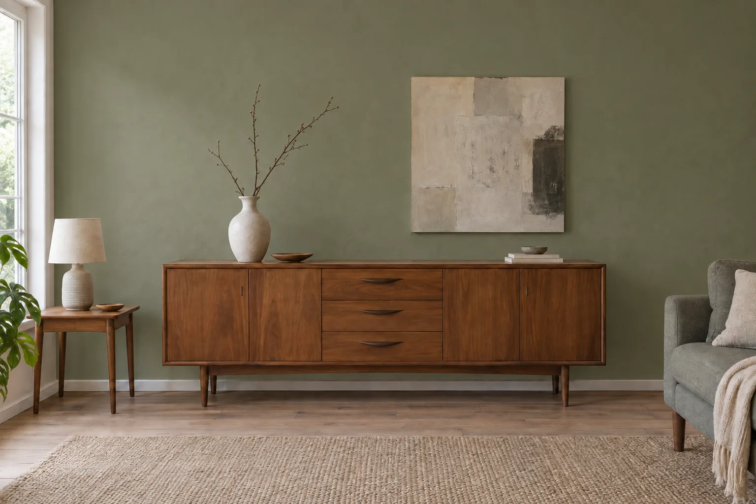
A greyed green is worth trying when the wood and floor feel too similar. In this study, the green separates the cabinet from the wall without using a bright colour. Look particularly at the top edge and side panels: that is where the relationship is easiest to judge.
With a reddish piece, decide whether you enjoy the extra emphasis on its warmth. A contrasting background can make a colour feel more noticeable rather than cancelling it. If your aim is to make the cabinet less orange, do not choose green on the assumption that it must neutralise the wood.
Test a quieter and a deeper green in separate viewing sessions. Keep the furniture and textiles in place. The useful decision is which complete view you enjoy, not which isolated painted card seems more sophisticated.
Deep blue: make the silhouette part of the room
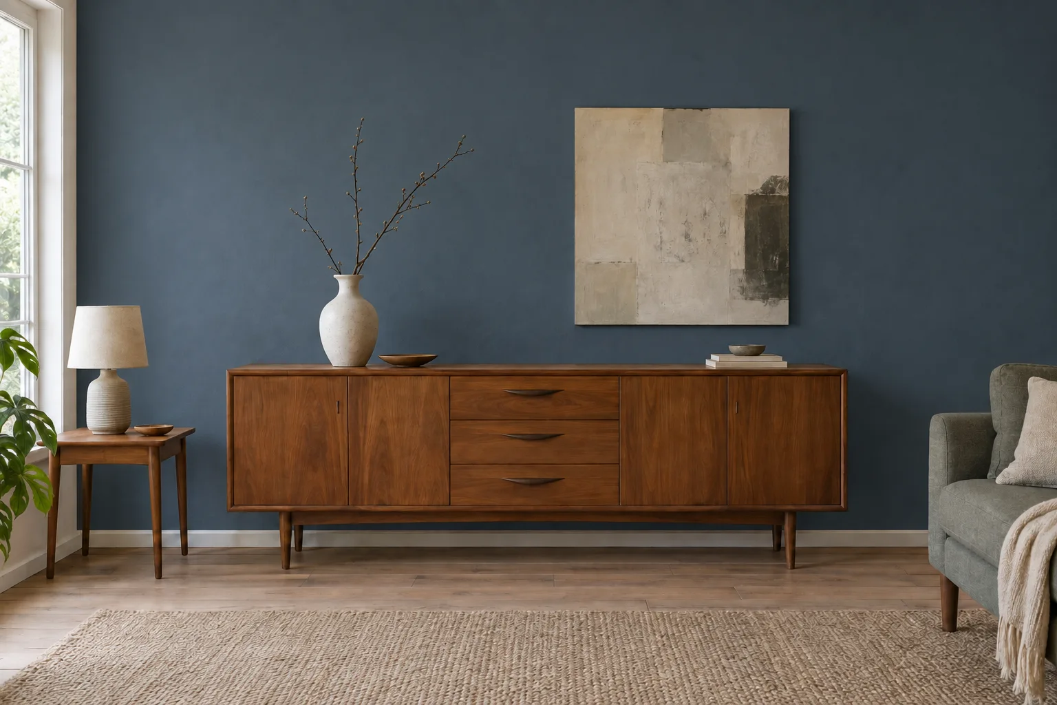
A deep blue background can make warm timber look more deliberate and give pale objects on top a stronger presence. Try it if you want the wall and cabinet to form a substantial composition, especially where the piece currently looks lost on a broad pale surface.
For a dark walnut cabinet, check whether the sides and legs remain distinct in evening light. A dark wall can look rich in a daylight photograph yet flatten the piece after sunset. Use your normal lamps during the sample review and look from the seat where you spend the evening.
You can also decide that the darker direction asks too much of the room. That is a useful result from a sample, before buying the full quantity of paint. There is no need to compensate immediately by replacing the rug, curtains and sofa.
Make the final choice on the real wall
Little Greene recommends large painted samples on card or lining paper, with two coats allowed to dry, moved around the room and checked under different lighting. Its sample pots use a particular matt finish, so confirm how your chosen final finish may differ. Follow the paint maker’s own preparation instructions for the product you use.[1]
Compare one candidate at a time beside the cabinet, near the floor and in the less brightly lit part of the wall. Keep a small written record: morning, afternoon and normal evening lamps. Avoid deciding from a cluster of tiny competing swatches that you never see at room scale.
Screens are useful for collecting possibilities, but Little Greene cautions that digital colour is not an exact match to paint. Do not order a colour to reproduce a pixel in these room studies. Obtain a physical sample and make the decision in your room.[2]
A small decision sheet
Keep the furniture and floor. Desired effect: quiet / gently contrasting / dramatic. Candidate colour and finish: ____. Beside the cabinet in daylight: ____. Beside the floor: ____. Under evening lamps: ____. Final choice after the dry sample review: ____.
If the difficulty is mainly the relationship between several wooden surfaces, see mixing vintage wood with your existing floor. Keep this wall-colour decision focused enough that you can finish it and enjoy the furniture you bought.