The colour arrived after the chair
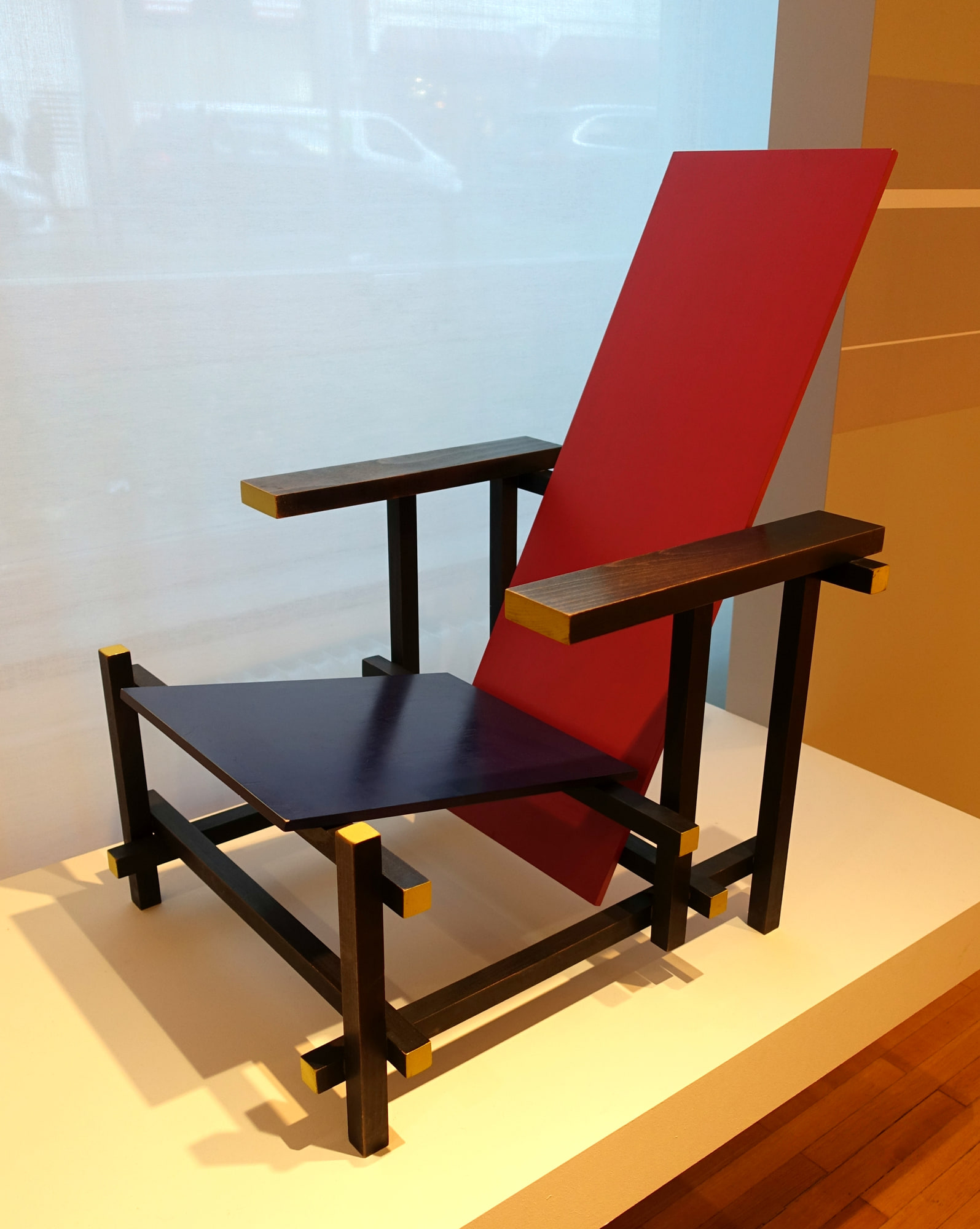
Why does the Red Blue Chair look less like a solid piece of furniture than a drawing made through a room? Because Gerrit Rietveld let its parts keep their individual identities. Narrow wooden lines support two broad planes, and the empty space between them remains visible. The chair does not occupy a block; it marks a few coordinates and leaves the rest of the room alone.
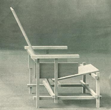
The surprise is that this argument existed before the colours that made it famous. MoMA dates its unpainted prototype to 1917–18 and says Rietveld originally designed the chair in 1918. The red, blue, yellow and black scheme was applied only around 1923.2 1
The small photograph published in De Stijl in September 1919 is therefore not a deficient Red Blue Chair waiting for paint. It shows that the structure was already the idea. Colour later made that idea louder.
A chair that refuses to become a block
Most chairs can be read as a compact hierarchy: four legs support a seat; a back rises from it; arms, if present, close the sides. Rietveld's chair keeps breaking that expected outline. Horizontal and vertical battens extend beyond the places where they meet. Their ends remain visible, so each member appears to continue through the joint rather than terminate inside it.
That visual independence matters. Look at one front corner and the eye can follow a black horizontal member beyond the vertical support. Move upwards and another line crosses the composition at a different depth. The joints make a working frame, but the projecting ends make the frame readable as a set of intersections.
MoMA describes the design through rectilinear volumes and horizontal and vertical planes, relating this manipulation of space to Rietveld's work as an architect. The Centraal Museum makes the point more directly: the chair leaves the surrounding space intact.1 3
It is furniture that declines to become a small wooden room of its own. Even the armrests are narrow lines rather than padded borders. Upholstery was not invited to this particular meeting.
Two planes meet the body
The frame is not the whole chair. A blue seat and red back cross it as two separate surfaces, slightly inclined and visibly detached from the black members around them. One receives the sitter's weight; the other supports the back. Their jobs are ordinary. Their presentation is not.
Because the planes do not merge into a thick upholstered shell, their angle, edge and position stay exposed. From the side, the red back appears to lean within the lattice. From the front, the blue seat sits low behind the forward rail. MoMA records its painted example at 33 centimetres to the seat, a useful reminder that the chair is a physical object with a notably low posture, not only a composition reproduced in books.1
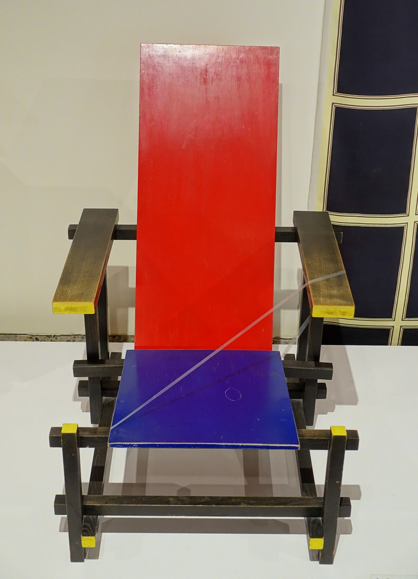
The 1960s Montreal example beside this chapter makes that physicality hard to miss. Paint has worn on the broad surfaces and at the points of use. It is a later chair, not the prototype, but it shows what a diagram cannot: planes have thickness, edges receive knocks and bodies leave evidence.
Paint as a set of instructions
Once colour arrived, it did not disguise the construction. It labelled it. Black pushes the linear frame backwards; red isolates the back; blue separates the seat; yellow catches the short ends of selected members. A part can be seen first as colour and then followed as timber.
That scheme belongs to the chair's relationship with De Stijl, whose artists used primary colour, neutral tones and independent planes to imagine a more open visual order. MoMA connects Rietveld's spatial construction and later palette to those shared ideas. The Centraal Museum likewise notes that the colours emphasise the separate battens and the space around them. 13
This is why repainting the story as “Rietveld chose four famous colours” misses the useful part. The colours are not a decorative recipe laid over a normal chair. They help the eye understand which element is doing what, and where one element stops being another.
Standard timber, unreasonable ambition
For all its resemblance to an art object, the chair was not conceived as a display of rare material or invisible handwork. MoMA notes that Rietveld used standard lumber sizes and hoped the chair could eventually be mass-produced. That ambition fits the reduction: repeated rectangular sections, flat planes and no carved ornament.1
Standard parts do not make the object casual. The intersections must hold the planes at their intended heights and angles while keeping the projecting ends visually precise. A small error would not disappear beneath upholstery or moulding. Reduction concentrates attention on assembly.
The chair's importance lies partly in that tension. It proposes an elementary vocabulary suitable for repetition, yet it uses that vocabulary to make an unusually radical object. Familiar boards and battens do not lead back to a familiar chair. They lead to something closer to a coordinate system that has agreed, somewhat sternly, to hold a person.
One design, many physical chairs
Museum dates make the final distinction visible. MoMA records a prototype of 1917–18 and a painted Red Blue Chair under the range 1918–1923. The Centraal Museum uses 1919 for its own chair account. The Montreal photograph shows an example from the 1960s. These dates can coexist because a design history and the history of one physical chair are not the same thing. 2 3
The evidence reviewed here establishes Rietveld's design, its early unpainted state and the later colour scheme. It does not turn red paint, a blue seat and projecting black battens into a certificate of age or authorship. A physical chair still needs its own maker, construction, labels, provenance and object date examined.
That boundary does not weaken the design story. It reveals the reason the chair can remain permanent in the Library while individual examples come from different decades. The design is the open arrangement of lines, planes and space. Each surviving chair is one dated attempt to make that arrangement physical.


,_wood_-_Montreal_Museum_of_Fine_Arts_-_Montreal,_Canada_-_DSC08989.jpg)