Keep three layers in view
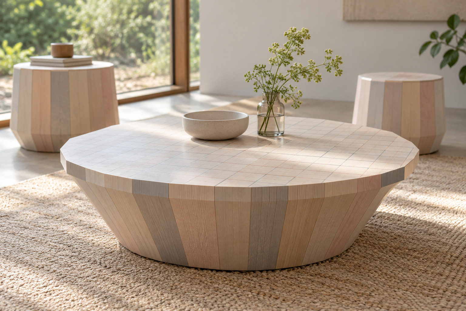
The table offers wood grain, translucent colour and printed pattern without requiring one to cancel the others. The eye can move from a broad coloured volume to the finer graphic marks, then return to the timber underneath.
Scholten & Baijings’s archive explains the layered treatment and dates Colour Wood to 2009.1 Stefan Scholten and Carole Baijings share the credit. Colour is already part of their thinking about the object, rather than a final decorative choice applied after its form is settled.
Small sections can make a generous volume
The designers describe joining narrow timber sections into a larger table volume.1 The repeated sections give the body its rhythm. This makes the assembly a useful part of the visual story, especially where a curved outline meets the changing direction of the grain.
Karimoku’s July 2010 release introduces the collection in three sizes and identifies chestnut.2 The designer page instead describes oak.1 The reason for that difference is not established here. Keeping each description attached to its own record avoids inventing a universal recipe.
Follow the conversation across countries
Karimoku New Standard brings the Dutch duo’s design into Japanese production.2 The geography matters because authorship and manufacture are different contributions, joined through one furniture project.
Colour Wood makes that conversation tangible on a small scale. Its quiet table shape holds grain, construction, colour and graphic play together. A familiar piece of furniture becomes a reason to look more closely at how its surface was thought through.