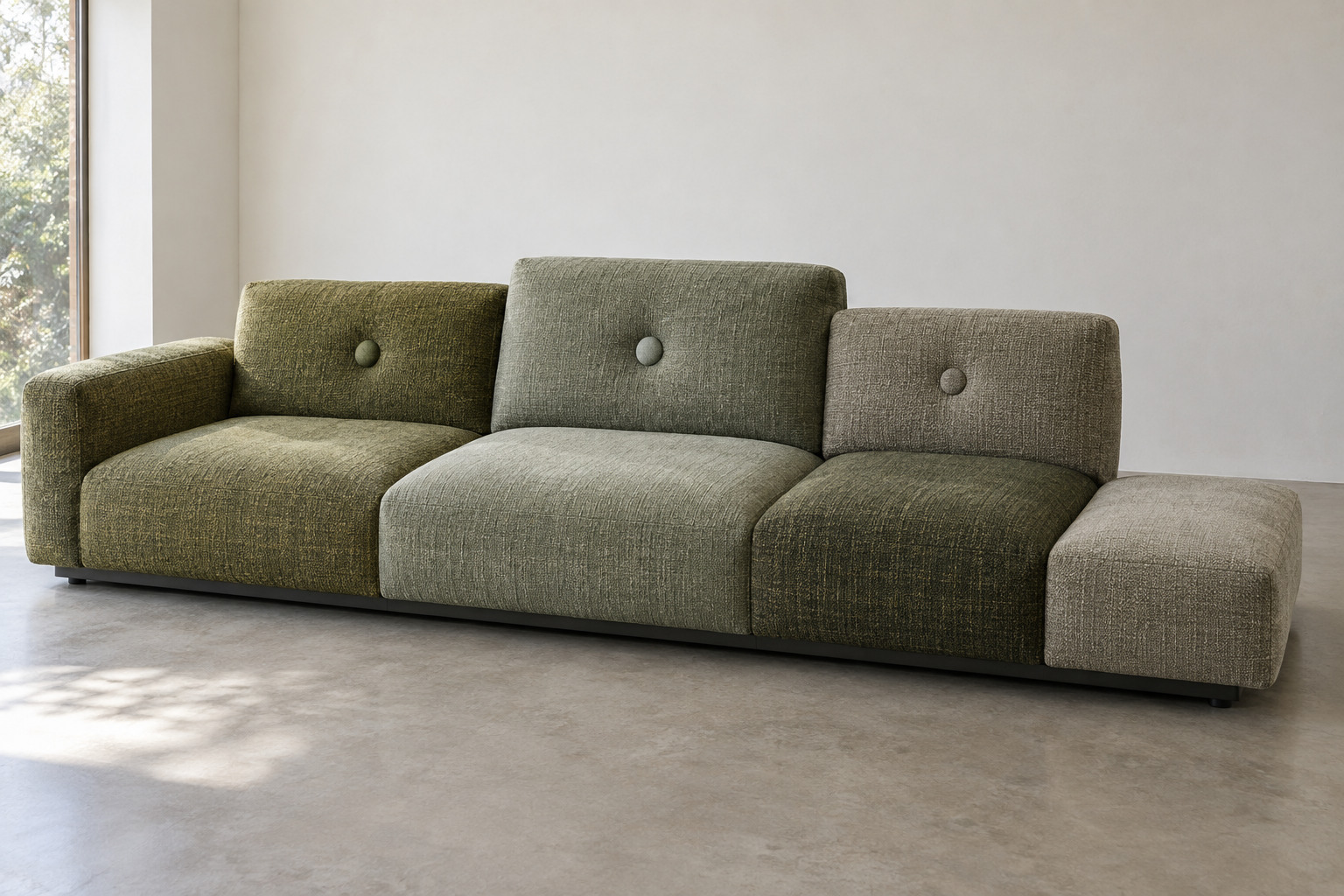
One colour can contain several surfaces
A sofa covered in different fabrics could look like a pile of unrelated cushions. Polder holds the differences within a deliberate arrangement. A darker patch changes the weight of one area; a warmer neighbour shifts how the adjacent colour appears.
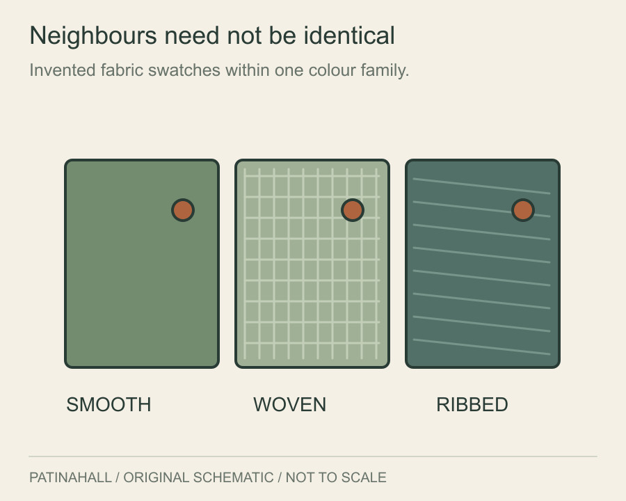
Texture adds a second comparison. A smooth cloth and a more visibly woven cloth can belong to a similar colour family while catching light differently. Their relationship changes as you move around the sofa or as daylight changes across the room.
Jongerius’s studio records the original Polder as a 2005 collaboration with Vitra and her first industrially designed piece of furniture. The combination brought her interest in material variation into a repeatable furniture product.1
The button is doing several jobs
The studio’s account of the 2015 revision is unusually revealing about the buttons. It describes industrial components combining plastic, aluminium, brass and leather, replacing an earlier approach closer to handicraft. The buttons also formed part of a fastening system that made the covers easier to remove.2
At the scale of the whole sofa, a button is a small mark. Up close, it becomes an assembled object with its own colour, surface and construction. It can interrupt a large cushion just enough to give the eye somewhere to stop.
That detail makes the usual division between decoration and utility less useful. The component is visible because it contributes to the composition, but it also has work to do. Neither description quite covers it alone.
Unequal ends change the silhouette
The asymmetry continues at the edges. Vitra distinguishes Polder’s lower platform at one end from Polder Compact’s pair of armrests at different heights. The family therefore contains different ways of finishing the seat, as well as left and right configurations.3
An armrest closes an edge. A lower platform lets the horizontal surface continue. Even before anyone sits down, those two endings suggest different ways of approaching the sofa.
The effect is easier to notice if you temporarily ignore the colour. Follow the top line across the back, down to the ends and along the seat. The composition has unequal levels as well as unequal patches.
A finished object can keep its differences
For the 2010–11 exhibition Misfit at Museum Boijmans Van Beuningen, Jongerius’s work was arranged by colour, bringing experiments and finished objects into the same visual conversation. The studio’s account presents the display as a way of looking across stages of making.4
Polder rewards a similar approach. Start with the room-sized impression, then move through the fabrics to the smallest fastening. Each distance reveals another decision. What seemed to be one colour from the doorway turns out to have quite a lot going on inside it.